"In the beginning God created heaven, and earth. And the earth was void and empty, and darkness was upon the face of the deep; and the spirit of God moved over the waters." Genesis 1:1-2
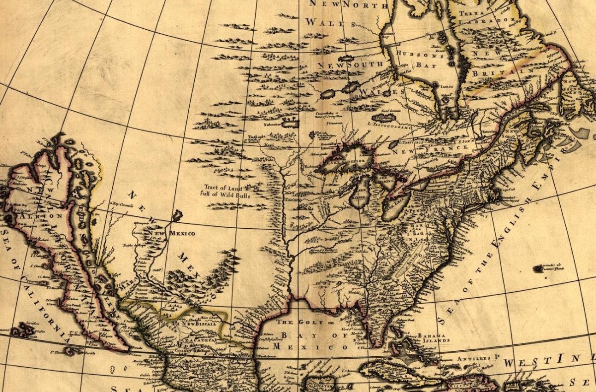
I love maps. They tie so many of my interests together — the Earth, history, frontiers, negative space, filtering, scale. Cartography is the art and science that most closely embodies much of the way I think about the world.
I began making maps in college. Initially I made maps with my hands. I learned to navigate in the field using a Brunton compass (famous among geologists), to estimate distances using the steps and span of my gait, to identify rock formations under foot and at a distance by eye, to measure the strike and dip of exposed strata, to follow and trace contacts between rock units, and combined these skills to create geologic maps of field sites around the country. My first experience putting these tools to use occurred during my field methods course when I traversed a ranch in the Llano Uplift of the Texas Hill Country and mapped iconic Precambrian pink granites and their white mantle of Cretaceous-age limestone. I was then flung into the mapping deep-end during my time in field camp when I spent six summer weeks camping, hiking, and mapping the backcountry of southeastern Utah and southwestern Montana. I got to know well the spectacularly exposed sandstones, scorias, and gneisses of the American West — the dream of any self-respecting American geologist. Field mapping is an amazing pairing of the embodied and the intellectual life. Hiking up a mountain under the desert sun to pursue a fault splitting ancient strata separated in time by hundreds of millions of years is hard to beat.
I have also worked with geographic information systems in the past. I worked with all sorts of geospatial data, ranging from county roads to municipal zoning districts and from ocean drilling sites to Martian asteroid impact locations. I spent a summer with the City of Houston digitizing public drinking water, wastewater, and stormwater lines, and a few months with CenterPoint Energy QA/QCing their geodatabase documenting natural gas pipelines in southeast Texas. Diving into out-dated databases to clean, re-organize, and find the most appropriate way to present geographic features highlighted the power of raw computation joined to reams of geospatial data. Digital mapping is quite different from physical mapping. My field maps were rough-hewn given that they were drawn on foot in the field and at night by lamp light. My GIS maps were polished to a degree of refinement unknown to my hand-drawn maps. You can rely on computer servers to store in vast quantities of interesting data to portray, while when drawing you are limited by what the human hand can bring to life.
When we view a map we are observing the world through a unique lens which the map-maker has ground for us. A basic way that this framing occurs is in the choice of map projection. A map projection is the way in which the three-dimensional surface of the Earth is projected onto the two-dimensional map that we hold in our hands or observe on a screen. It is physically impossible to represent with complete accuracy the features of a globe on a flat surface. If it were possible, then what extra information would we receive from the third dimension? All map projections are wrong, but each has their own application where they shine. The projection that we're all probably most familiar with is the Mercator projection. You likely saw some version of this world map hanging on a wall in your elementary school, at least if you're an American. This map projection was especially useful for early mariners because the cardinal directions on the map align with directions obtained using a compass. However, utility in domain causes problems in others. The areal extent of land is extremely skewed in the Mercator projection, increasingly so as you move up toward the poles. This leads landmasses in the higher latitudes, like Greenland and Antarctica, to look proportionally way larger than they would appear on a globe. Analagous trade-offs are at work in every step taken in the creation of a map, be it the choice of legend, labels, data, color scheme and anything else that gets plotted.
A grasp of the concept of scale is also important for both the cartographer and the observer. The scale at which information is presented controls what is seen by the observer. As you "zoom out" on a map, consolidation of detailed information occurs so the observer is not overwhelmed and a synoptic overview of relevant features can be displayed. As you "zoom in" on a map, more and more local-scale information can be shown without overwhelming the viewer but at the expense of the overall picture. There are no upper or lower limits to this process. There is no objective, optimal choice of map scale. Complexity manifests itself from all vantage points. An interesting example of this phenomenon is the paradox of measuring the length of coastlines. Surely we can objectively measure this value? Turns out, not exactly. The smaller the "ruler" used to measure the coast, the longer the coast becomes. Why is this so? Imagine what would happen if you use a one-kilometer long ruler to trace the whole island versus if you were to use a one-meter long one. The longer ruler is going to miss many of the dips and curves, cut-backs and reversals that nature shapes the seashore into, while the shorter one will pick up more of these features leading to different measured lengths. This is true of all things we map and attempt to understand, not just length as used in this example. Viewing the world at different scales changes what you see.
We all make maps in one way or another. The mental map of your neighborhood that you use on your walks, the tentative plan in your head for what you'll be doing six months down the line, or the network of your friends, family, acquaintances, and mutuals — all are examples of cartography in action. Mapping attempts to reduce the chaos of nature into a form more readily accessible to human reason. By necessity the act of mapping obscures some aspects of reality while exaggerating other parts of it. The clichéd saying that "the map is not the territory" is cliché for good reason. If you don't bring a skeptic's mind to the examination a map then you are likely to be mislead by its sense of order. The real world is disordered, uncertain, and incompletely known. The map world is ordered, certain, and completely known, or at least is internally consistent. Distortions, ambiguities, and what you can't see are crucial to ponder when studying any map as much is lost in translation.


